Box Plot vs Violin Plot: Which One is More Powerful for Research Articles?
In one word, violin plot is more descriptive visualization than box plot. Can we use violin plot in all cases? The answer depends on the condition - we choose between box plot or violin plot based on our visualization needs.
Example Dataset:
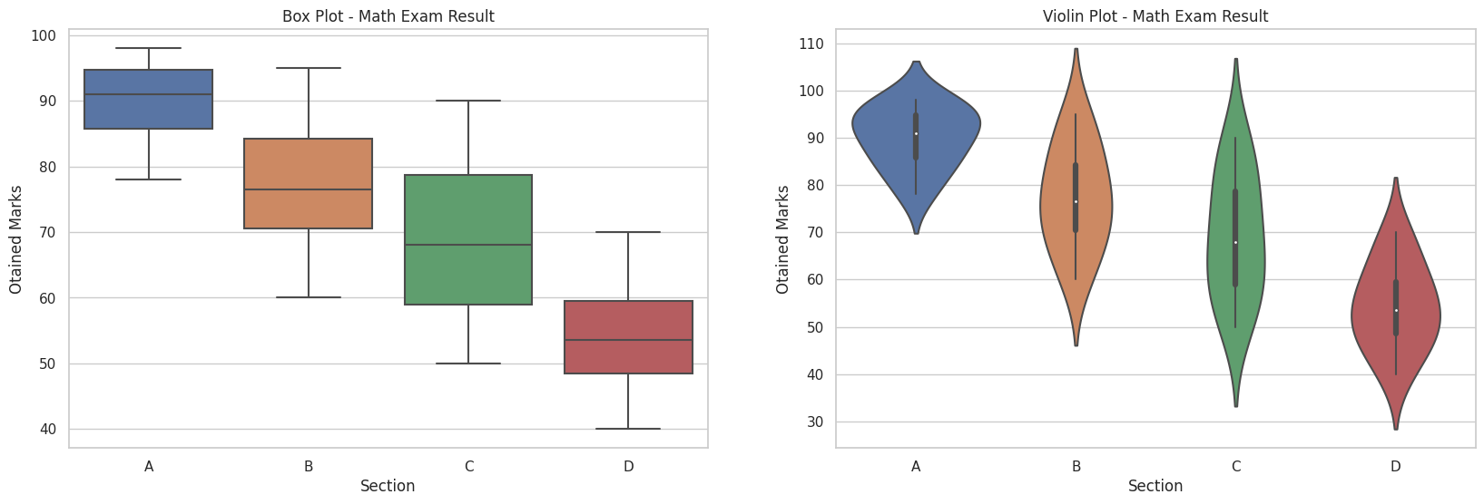
Obtained marks in a course of four different sections (Random Data):
- Section A: [78, 83, 85, 88, 90, 92, 94, 95, 97, 98]
- Section B: [60, 65, 70, 72, 75, 78, 82, 85, 90, 95]
- Section C: [50, 55, 58, 62, 66, 70, 75, 80, 85, 90]
- Section D: [40, 45, 48, 50, 52, 55, 58, 60, 65, 70]

Box plot and violin plot for same data. (Source code to generate this figure appears at the end of this post)
Comparative Analysis
Box Plot Characteristics:
- Represents distribution using quartiles (Q1, median, Q3) and whiskers
- Clearly shows median (middle line) and interquartile range (box edges)
- Identifies outliers as individual points
- Effective for comparing central tendency and spread between groups
Violin Plot Characteristics:
- Combines box plot statistics with kernel density estimation
- Width represents probability density at different values
- Reveals multimodal distributions and subtle patterns
- Shows quartiles and median within the density shape (white dot)
Use Case Recommendations
When to Use Box Plots
- For concise statistical summaries
- When comparing central tendency across groups
- For identifying outliers in large datasets
- When space constraints exist (multiple subplots)
When to Use Violin Plots
- To reveal distribution shapes and density
- When analyzing multimodal distributions
- For small-to-medium sized datasets
- When detailed distribution comparison is needed
Implementation Example
import seaborn as sns
import matplotlib.pyplot as plt

section_a = [78, 83, 85, 88, 90, 92, 94, 95, 97, 98]
section_b = [60, 65, 70, 72, 75, 78, 82, 85, 90, 95]
section_c = [50, 55, 58, 62, 66, 70, 75, 80, 85, 90]
section_d = [40, 45, 48, 50, 52, 55, 58, 60, 65, 70]

data = {'section': ['A']*10 + ['B']*10 + ['C']*10 + ['D']*10,
        'marks': section_a + section_b + section_c + section_d}

plt.figure(figsize=(20, 6))
plt.subplot(1,2,1)
sns.boxplot(x='section', y='marks', data=data)
plt.title('Box Plot - Math Exam Result')

plt.subplot(1,2,2)
sns.violinplot(x='section', y='marks', data=data)
plt.title('Violin Plot - Math Exam Result')
plt.show()