Box Plot VS Violin Plot: Which one is powerfull for research articles
Published:
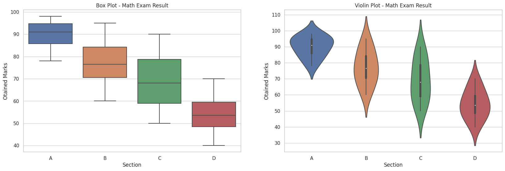
In one word violin plot is more descriptive visualization rather than box plot. Can we use violin plot in all cases? The answer is depending on the condition, we use box plot or violin plot.
let’s see an example:
Data: Obtained marks in a course of four different sections. (Random Data)
Section A: [78, 83, 85, 88, 90, 92, 94, 95, 97, 98]
Section B: [60, 65, 70, 72, 75, 78, 82, 85, 90, 95]
Section C: [50, 55, 58, 62, 66, 70, 75, 80, 85, 90]
Section D: [40, 45, 48, 50, 52, 55, 58, 60, 65, 70]

*Source code to generate this figure is at last of this post
The box plot will show the distribution of marks for each section using boxes and whiskers, while the violin plot will display the density estimation of the obtained marks using width of each level.
Box Plot:
- Represents the distribution of marks within each Section using a box and whiskers.
- Displays the median (middle line within the box) along with the first quartile (lower edge of the box) and third quartile (upper edge of the box).
- Shows any outliers as individual data points beyond the whiskers.
Violin Plot:
- Shows the distribution of marks within each section using a kernel density estimation, which provides an estimate of the probability density function.
- The width of the violin represents the density or frequency of marks at different values.
- Displays the quartiles and median similar to the box plot within the violin plot (White dot is median).
- Provides a more detailed representation of the data distribution, including multiple peaks or modes.
Violin plot represents all property of boxplot (median, 1st quartile, 3rd quartile) and data distribution or probability density.
Use case:
Box Plot:
- Summarizes the distribution of data using key statistical measures such as the median, quartiles, and potential outliers.
- Effective in identifying differences in central tendency, spread, and skewness between different groups.
- Useful when the focus is on summarizing and comparing the central tendency and variability of the data.
Violin Plot:
- Provides a more detailed view of the data distribution compared to a box plot.
- Displays the density estimation of the data, showing peaks or modes in the distribution.
- Particularly useful when examining multimodal distributions or comparing the shape of distributions across different groups.
- Can be beneficial in understanding the underlying distribution of the data, including potential asymmetry, skewness, or presence of multiple modes.
- Useful when the focus is on visualizing the entire distribution and comparing the shapes of the distributions across groups.
In summary, the choice between box plots and violin plots depends on the specific insights you want to gain from your data and the level of detail you need to visualize. Box plots are excellent for providing a concise summary of key statistical measures and identifying differences in central tendency and spread, while violin plots offer a more detailed view of the distribution shape, especially in the presence of multiple modes or asymmetry. If our objective is to present only key statistical measures such as the median, and quartiles, we use box plots. On the other hand, if it is important to represent the data distribution of each point, we use violin plot.
Source code to generate the above figure:
# Use seaborn and matplot library
import seaborn as sns
import matplotlib.pyplot as plt

# Previous figure data
section_a = [78, 83, 85, 88, 90, 92, 94, 95, 97, 98]
section_b = [60, 65, 70, 72, 75, 78, 82, 85, 90, 95]
section_c = [50, 55, 58, 62, 66, 70, 75, 80, 85, 90]
section_d = [40, 45, 48, 50, 52, 55, 58, 60, 65, 70]

# Create dictionary from above data
data = {'section': ['A'] * len(section_a) + ['B'] * len(section_b) + ['C'] * len(section_c) + ['D'] * len(section_d),
        'marks': section_a + section_b + section_c + section_d}

# Box plot
plt.figure(figsize=(20, 6))
plt.subplot(1,2,1)
sns.boxplot(x='section', y='marks', data=data)
plt.title('Box Plot - Math Exam Result')
plt.xlabel('Section')
plt.ylabel('Otained Marks')

# Violin plot
plt.subplot(1,2,2)
sns.violinplot(x='section', y='marks', data=data)
plt.title('Violin Plot - Math Exam Result')
plt.xlabel('Section')
plt.ylabel('Otained Marks')
plt.show()
